Color, the painter’s palette for the soul, has the remarkable ability to evoke emotions, set moods, and breathe life into our surroundings. Nowhere is this power more evident than in the art of accent walls. These strategic bursts of color can transform a room from mundane to mesmerizing, from bland to breathtaking. Join us as we delve into the captivating world of color, exploring how it defines drama—the very heart and soul of accent walls.
a) The Emotional Palette
Color is not just a visual experience; it’s a journey through emotions. Every shade has a story to tell, a mood to convey. In the realm of accent walls, understanding the emotional impact of color is key. Let’s explore the shades that set the stage:
1. Bold Reds and Warm Oranges: Passion and Energy
Picture an accent wall painted in fiery red or the cozy embrace of a warm orange. These colors radiate passion and energy, making them perfect for spaces where you want to create a vibrant, lively atmosphere. Consider using them in social areas like living rooms or dining spaces, where the goal is to spark conversations and create a sense of excitement.
2. Calming Blues and Tranquil Greens: Serenity and Balance
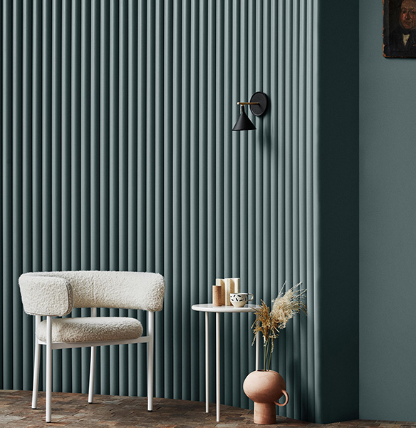
For those seeking a calm oasis within the home, soft blues and tranquil greens can work wonders. These shades evoke a sense of serenity, making them ideal for bedrooms or reading nooks where relaxation is the primary goal. They promote balance and harmony, inviting you to unwind and find peace amidst the chaos of daily life.
3. Regal Purples and Luxurious Golds: Opulence and Sophistication
Looking to add a touch of luxury to your space? Regal purples and deep, luxurious golds can do just that. These colors exude opulence and sophistication, making them a perfect choice for accent walls in elegant settings. Imagine a deep purple accent wall in a home office or a gold-accented wall in a formal dining room—it’s a statement of refined taste.
b) The Focal Point:
Now that we’ve explored the emotional impact of color, let’s discuss the significance of the focal point—the wall that demands attention:
An accent wall isn’t just any wall; it’s the heart of your design. It draws the eye, creates visual interest, and defines the room’s personality. When selecting the perfect wall for your accent, consider the following:
1. Architectural Features: Embrace the Unique
An accent wall often works best when it highlights an existing architectural feature. This could be a wall with a fireplace, a nook, or even a wall with interesting angles or alcoves. These features add depth and character to the accent, making it an organic part of the room’s design.
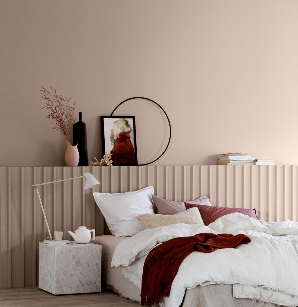
2. Natural Focal Point: The Head of the Room
In spaces like bedrooms, the wall behind the bed naturally becomes the focal point. By painting this wall with a contrasting color, you not only add drama but also create a visually striking backdrop for the room’s centerpiece—the bed.
3. Visual Balance: Finding the Sweet Spot
While the accent wall should demand attention, it’s essential to strike a balance. Avoid choosing a wall that’s too overpowering or too insignificant. Consider the overall layout of the room, the placement of furniture, and the flow of light. Your accent wall should harmonize with the surroundings while still standing out.
c) The Magic of Contrast:
One of the most compelling ways to define drama with color is through contrast. Choosing a color that complements the room’s existing palette while providing a striking difference can make your accent wall truly pop.
1. Light and Dark: The Yin and Yang of Color
If your room features light-colored walls, consider a deeper, richer shade for the accent wall. The contrast between the two tones creates a captivating visual dynamic. Think of it as the yin and yang of color – the interplay between light and dark brings balance and harmony to your space.
A light room with a dark accent wall adds depth and sophistication, immediately drawing the eye towards the focal point. This contrast not only captures attention but also creates a sense of coziness and intimacy, making the space inviting and compelling.
2. Bold and Neutral: Creating Visual Impact
For those with neutral or monochromatic color schemes, a bold and vibrant accent wall can be the ultimate showstopper. Imagine a room adorned in shades of white, gray, and beige – now picture one wall drenched in a bold jewel tone like emerald green or sapphire blue. The result is an explosion of energy and life that injects a sense of daring excitement into your space.
The juxtaposition of the neutral surroundings against the vividness of the accent wall creates an arresting contrast that feels modern and innovative. This approach is particularly effective in minimalist designs, where the accent wall becomes the focal point, captivating attention without overwhelming the space.
3. Cool and Warm: A Contrast of Temperature
Another way to employ contrast is through the temperature of colors. Cool colors like blues and greens can be paired with warm shades such as oranges and reds. This contrast not only adds visual intrigue but also contributes to the atmosphere of the room.
Picture a serene bedroom with cool blue walls and a warm, fiery red accent wall behind the headboard. The cool-warm contrast generates a sense of balance and a unique ambiance that’s both calming and invigorating. This technique can be especially powerful in spaces where you want to evoke specific emotions – whether it’s relaxation, energy, or creativity.
4. Texture and Flatness: Adding Dimension
Contrast isn’t limited to just color – it extends to texture as well. The tactile nature of texture can introduce a whole new layer of contrast. Consider pairing a smooth, flat accent wall color with textured decor elements like woven textiles, rough-hewn wood, or metallic accents. The interplay between the smoothness of the wall and the tactility of the textures creates an alluring contrast that engages both sight and touch. Get your unique, luxury & quality Jotun paint at Pergas Group.